
Why you should use Prometheus range vectors in your Grafana panels
Imagine you want to display the JVM metric system_cpu_usage in your Grafana dashboard.
You go ahead, create a panel with the query max(system_cpu_usage) since you wish to see the maximum CPU usage of all your instances.
And because you want a smooth graph, you make it more readable by limiting data points.
The query you are using is not wrong, but it might lead to a situation where you simply ignore data points in your graph.
If you don’t limit the maximum data points, Grafana calculates them based on the width of your panel.
Imagine the case where you are looking at a period of 30 days.
30 days have 30 * 24 * 60 = 43,200 minutes.
Let’s say the maximum data points of your panel are 1,000.
Grafana will query Prometheus for 1,000 data points, which are roughly 43,200 / 1,000 = 43.2 minutes apart from each other.
That means each data point you are seeing in Grafana represents the maximum of your system_cpu_usage at that particular point.
The 43 minutes between a point and the previous point are simply ignored.
Example
Consider the following simplified example to visualize the problem:
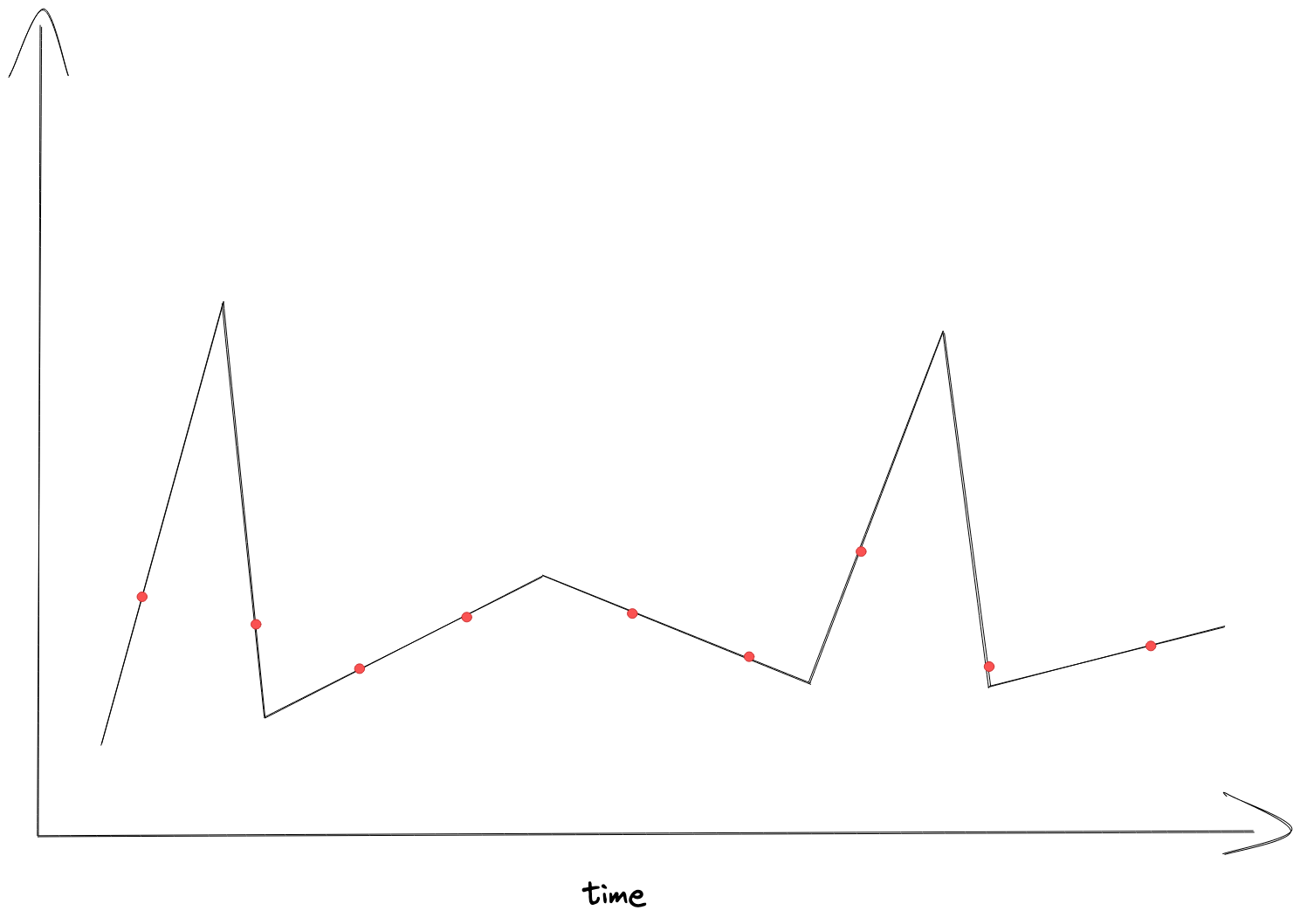 The black line is the real data saved in Prometheus.
The red dots, which are (more or less) spread equally (excuse me my bad visualizing skills 😅), are the data points retrieved by Grafana.
Your view in Grafana would look like that:
The black line is the real data saved in Prometheus.
The red dots, which are (more or less) spread equally (excuse me my bad visualizing skills 😅), are the data points retrieved by Grafana.
Your view in Grafana would look like that:
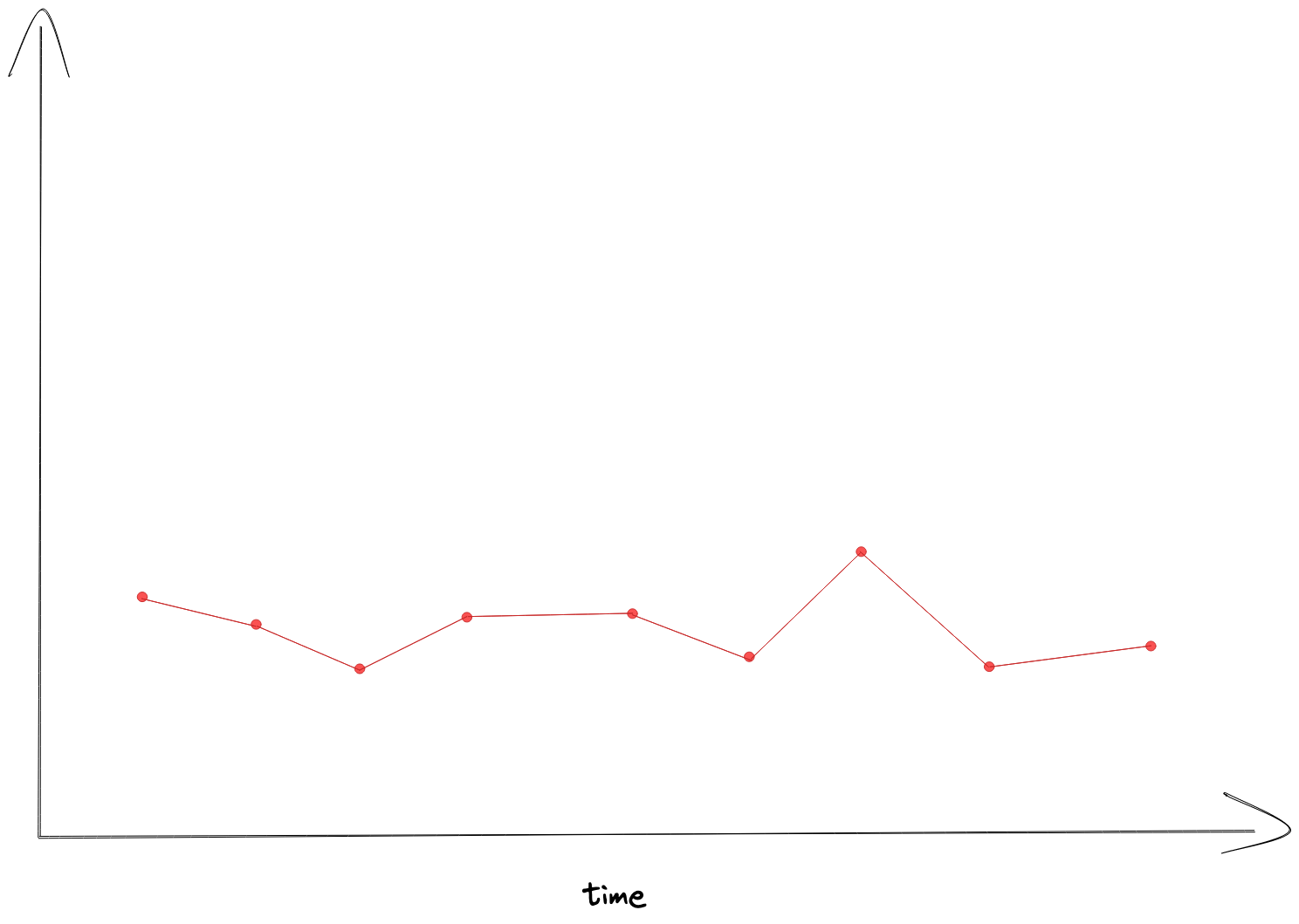 which is simply not showing the peaks of the original data.
Obviously, the issue gets bigger if you’re looking at long intervals or the maximum data points are only a few.
Prometheus Range Vector Selector and Aggregation functions
The solution to that issue is a mix of using range vector selectors and aggregation over time.
Instead of querying max(system_cpu_usage) you should use max(max_over_time(system_cpu_usage[$__rate_interval])).
The variable $__rate_interval is dynamically calculated by Grafana depending on time range and data points.
In simple terms: it is the time between data points.
The Prometheus function max_over_time reduces the vector to a single value, in this case the maximum value in the range.
Visualized, it would look something like that:
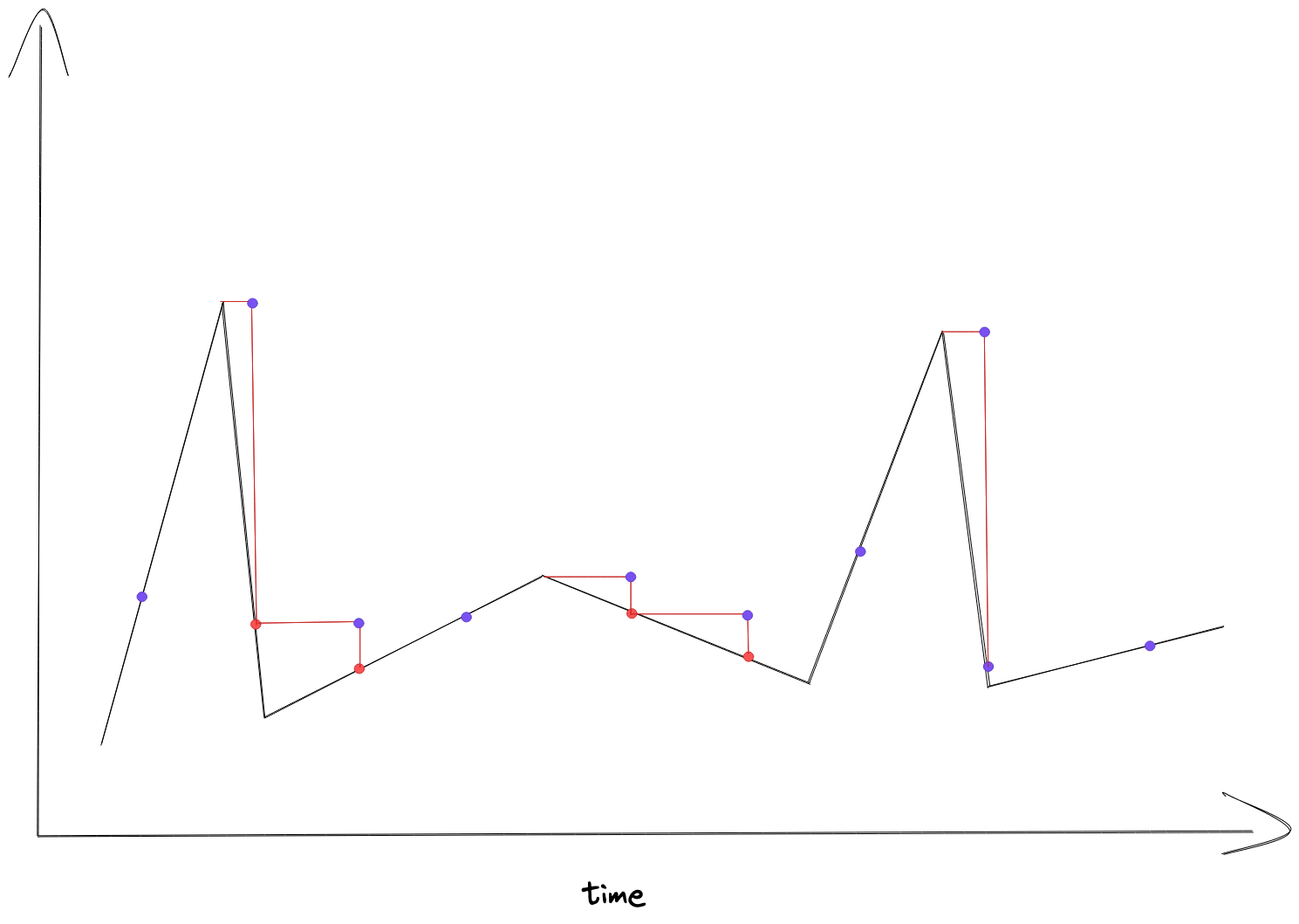 The red dots were the result of the original query, and the purple dots represent the resulting data from the improved query.
With the resulting view in Grafana:
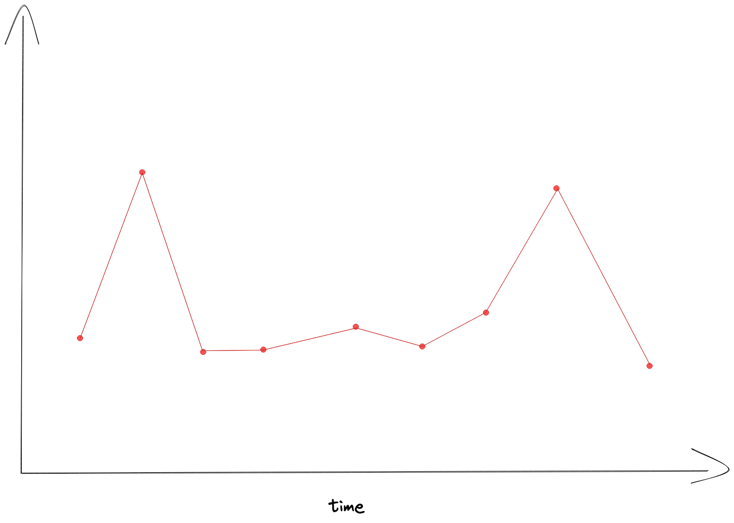 which is not hiding the peaks in your panel anymore.
Now you can zoom into the area with the peaks and have a look at the details.
Since
which is not hiding the peaks in your panel anymore.
Now you can zoom into the area with the peaks and have a look at the details.
Since $__rate_interval is dynamically calculated, the aggregated time gets smaller as you zoom in.
Summary
- Don’t use queries without range selector since you might not get a real view of the data
- Use Prometheus’ range vector selectors
- and aggregation over time