
TIL: How to make Grafana graphs more readable
Do you have some graphs in your Grafana dashboard which become hard on the eye when you look at longer time windows (e.g. 2 days, 1 week, …)?
Today I learned (TIL) — actually it was yesterday, but who cares? — how to resolve that issue.
Take for example the following graph:
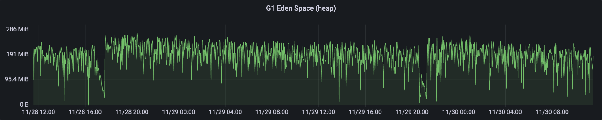
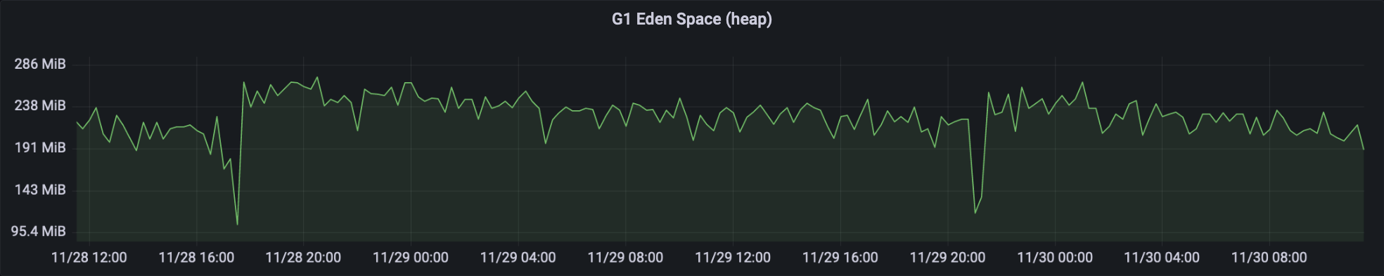
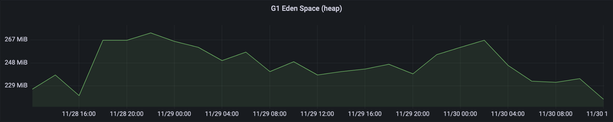
It’s not easy on the eyes, and eventually, you can interpret it. But isn’t the interpretation of the following graph easier and faster?
How Grafana calculates the amount of data points
Actually per default the number of data points is calculated based on the width of your graph. Grafana calculates an interval by using the amount of data points, the min interval and the selected time range. The interval is the time between two data points, and you can use it in the range vector selector.
Consider the following example:
- Selected time range:
48 hours=2,880 minutes - Max data points:
1,191(automatically provided by Grafana; see screenshot below) - Min interval:
30 seconds(per default the scraping interval) - Interval:
max((to - from) / datapoints; min_interval) = max(2,880 / 1,191; 0.5) = max(2.42; 0.5) = 2.42
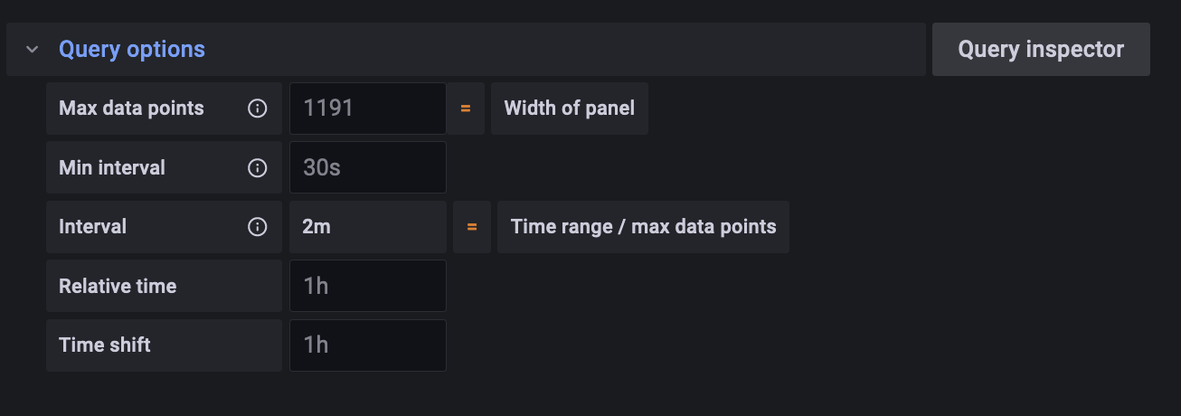
The calculated 2.42 is round to 2.
That means the $__interval variable is 2.
Grafana will execute your query and get 1,191 data points which are 2 minutes apart from each other.
How to make the graph more readable
The plotted query is max_over_time(jvm_memory_used_bytes{application="$application", id="$memory_pool_heap"}[$__rate_interval]).
Ignore the $__rate_interval and imagine it is $__interval.
I will write separately about it.
Now that we learned how Grafana calculates the amount of data points and the interval, the problem becomes obvious.
My brain isn’t good at interpreting 1,191 data points visually. 😅
You have basically two options to reduce the number of data points (and fix the problem):
- Decrease the maximum number of data points
- Increase the minimum interval
The issue with option 2 is, when you zoom in (let’s say you’re looking at a time window of 60 minutes)
and set the minimum interval to 15 minutes you’re looking at only 4 data points.
This setting isn’t really dynamic when it comes to different time windows.
Hence, I recommend option 1.
The actual number should be set depending on the width of your graph and how much smoothing is okay for you.
In the above example I set the maximum amount of data points to 200.
When you’re looking at 48 hours, the interval will be max(2,880 / 200, 0.5) = max(14.4, 0.5) = 14.4.
When you’re setting it to 60 minutes, the interval will be max(60 / 200, 0.5) = max(0.3, 0.5) = 0.5.
⚠️ Keep in mind that fewer data points means effectively smoothing the graph.
You should use a *_over_time function
in combination with [$__interval] or [$__range_interval] so that you do some aggregations for the data between the points in time.
An example for smoothing is the following graph with a maximum amount of 30 data points:
Summary
- Set the number of maximum data points to a reasonable amount
- Use a
*_over_timefunction and[$__interval]or[$__range_interval]in your queries